Style the components
Customize the widgets to match your brand.
The style configuration provides comprehensive settings for customizing the appearance of Inkeep widgets. This includes theming, typography, spacing, and component-specific styles.
Theme Configuration
The theme configuration is defined through the UserTheme interface which extends Partial<IkpTheme>. This allows for deep customization of the widget's appearance.
Theme Properties
Primary Colors
The primaryColors property allows you to define the color variations used throughout the widget. It accepts the following color options:
All colors should be provided as valid CSS color values (hex, rgb, hsl, etc). Each property is optional, allowing you to customize only the specific color variations you need.
Syntax Highlighter Theme
The syntaxHighlighter property lets you configure different themes for code blocks in light and dark modes.
By default, the Prism syntax highlighting theme we use is oneLight in light mode and vsDark in dark mode. To use a different theme, you can provide it in the theme.syntaxHighlighter prop.
You can use published Prism themes or create your own.
Custom Styles
The styles property allows injection of custom styles through two methods:
- External Resources (type: 'link'):
- Inline CSS (type: 'style'):
Each style entry requires:
key: A unique identifier to prevent duplicates and enable updatestype: Either 'link' for external resources or 'style' for inline CSSvalue: The style content (URL for links or CSS code for styles)
Variables Class Name
The varsClassName property specifies the class name for the container that holds CSS variables:
This class is added to a wrapper div that provides theming context.
Color Mode Configuration
The color mode configuration allows you to control how the widget handles light and dark modes. This is configured through the colorMode property in the base settings:
Color Mode Properties
Forced Color Mode
Use forcedColorMode to explicitly set the color mode for the current page:
System Color Mode
Enable enableSystem to automatically switch between dark and light modes based on the user's system preferences:
Color Mode Sync
The sync property allows you to synchronize the widget's color mode with your application's theme:
Common sync configurations:
- Data Attribute Sync:
- Class-based Sync:
Using CSS Variables
Inkeep provides a set of CSS variables that you can use to customize the widget's appearance. These variables are prefixed with --ikp- and are available within the scope of the widget.
Basic Usage
You can use Inkeep CSS variables within your stylesheets to customize elements. For example:
Dark Mode Styling
To apply specific styles for dark mode, use the [data-theme='dark'] attribute selector:
Style Recipes
Here are some common style recipes to help you get started with customizing the Inkeep components. These styles can be added to your custom CSS file or injected directly into the widget using the styles property in the theme configuration.
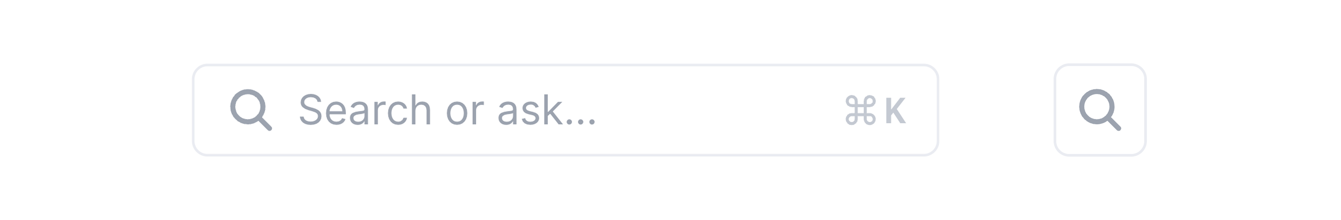
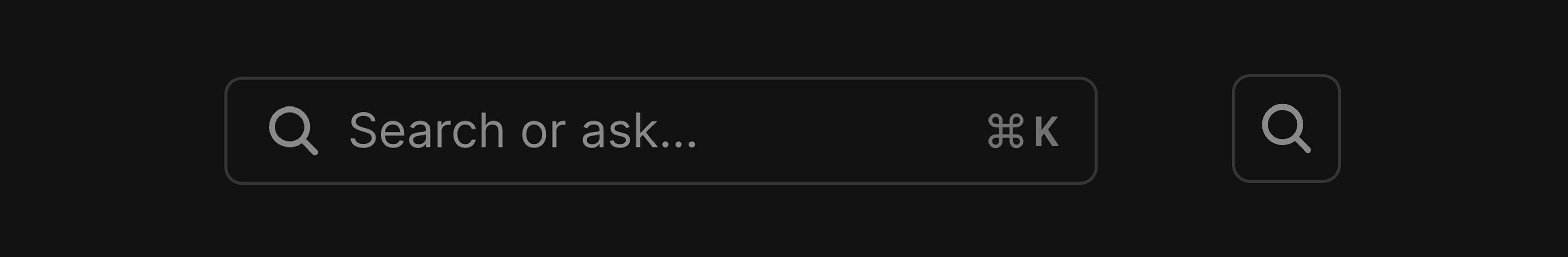
Responsive Search Bar
When space is tight on small screens, this will turn your full search bar into a simple search icon — perfect for navigation bars.
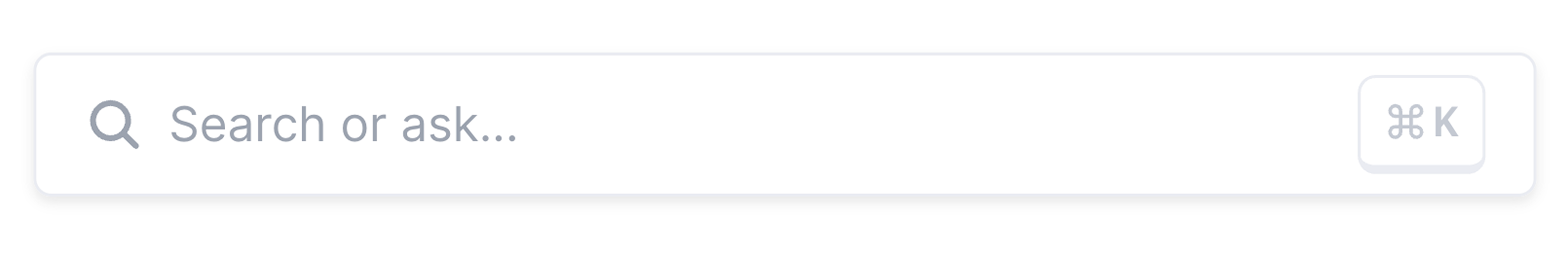
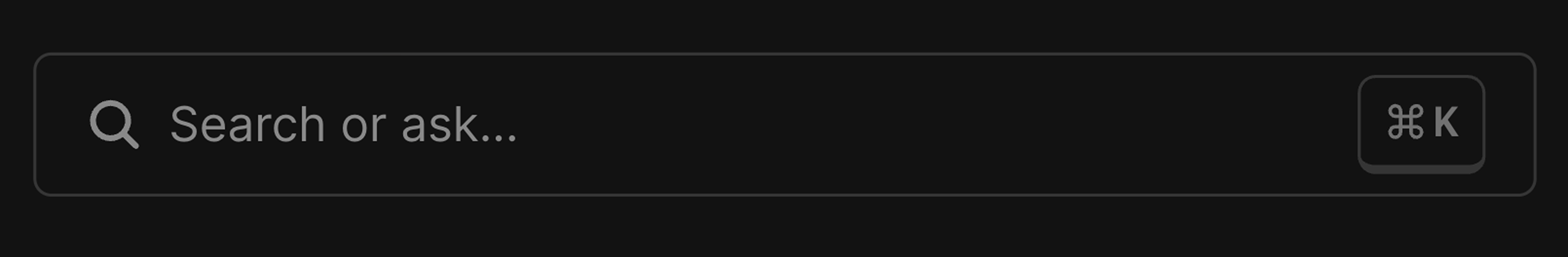
Emphasized search bar
Make your search bar stand out and feel more noticeable — perfect for when search is central to your app.
Non-floating chat button
Places the chat button directly in your app's layout — like a navbar or sidebar — instead of fixed and floating.

Changing the chat button background color
Customizing Icons
AI Assistant Avatar
The ai assistant avatar can be customized through the aiChatSettings using the aiAssistantAvatar property:
it's either a string URL or an object to specify light and dark mode avatars:
User Avatar
The user avatar can be customized using the userAvatar property in the aiChatSettings.
Custom Icons
You can customize various icons throughout the widget by providing a customIcons dictionary in the baseSettings. Each icon can be either a built-in icon or a custom SVG/image.
Available Icons
| Icon Name | Description |
|---|---|
| search | Search icon in search bar |
| thumbsUp | Thumbs up icon |
| thumbsDown | Thumbs down icon |
| messageCopy | Copy message icon |
| codeCopy | Copy code icon in code header |
| openLinkInNewTab | Used on hover in chat citations and search results (when shouldOpenLinksInNewTab is true) |
| openLinkInSameTab | Used on hover in chat citations and search results (when shouldOpenLinksInNewTab is false) |
| breadcrumbSeparator | Breadcrumb separator icon |
| switchToSearch | Switch to search icon |
| switchToChat | Switch to chat icon |
| chatSubmit | Chat submit icon |
| close | Close icon |
| info | Info icon next to the disclaimer and chat mode toggle |
| command | Command icon in search bar |
Example Configuration
If the url for a
customicon is a.svgfile it will be rendered as an<svg>, all other file types will be rendered using an<img>tag.
Default Theme
The default theme includes these core settings:
Typography
Z-Index
Component Class Names
All component class names are prefixed with ikp-. Here's the complete list of available class names: