Ui componentsCommon settings

AI Chat

Customize the chat experience for the Inkeep widgets.

InkeepAIChatSettings

This interface is used to configure the settings related to the AI chat. It is used in any component that renders the AI chat.

Properties

All are optional configurations.

PropertyTypeDescription
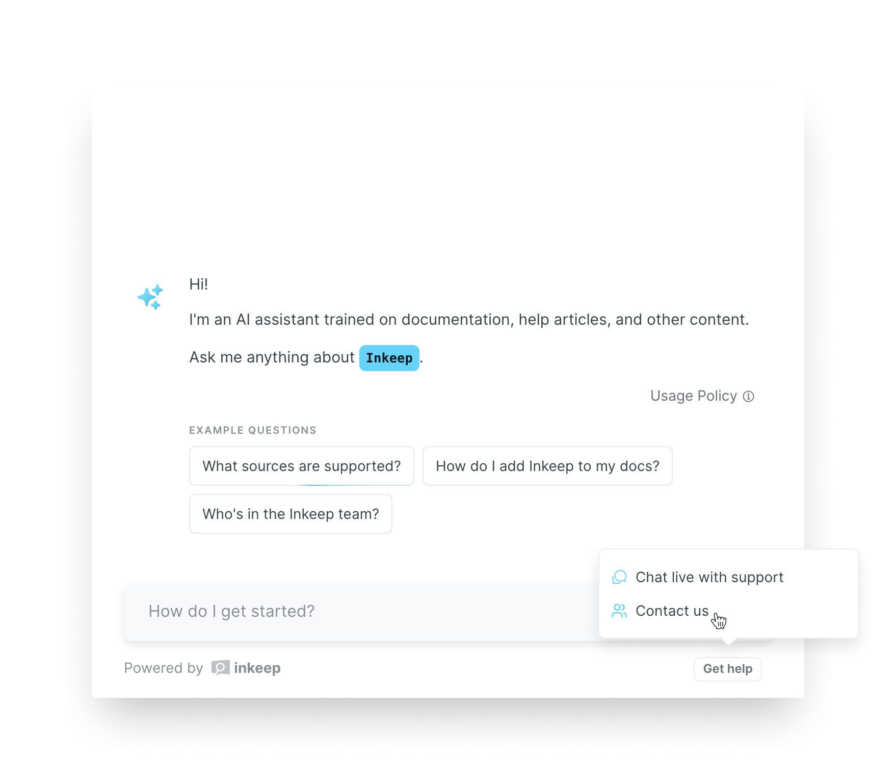
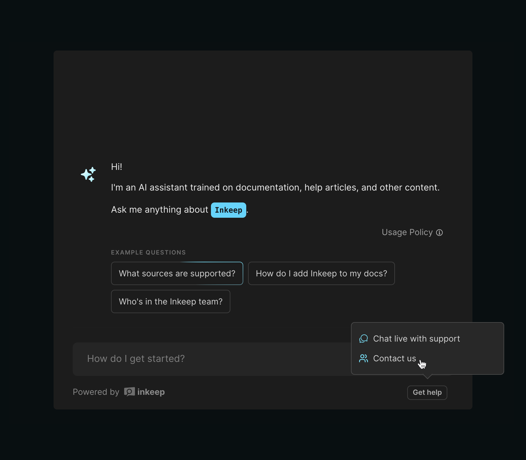
placeholderstringPlaceholder text for the chat input. Default How to get started?.
chatSubjectNamestringName of what the chat is about, e.g. "Inkeep". Defaults to the organizationDisplayName if not provided.
botNamestringName of the bot. Default undefined.
introMessagestringIntroductory bot message in markdown format. Default Hi! \n\n I'm.... See the example below for the pattern used.
contextstringInformation about the user that might be helpful to ground answers for the bot. Default undefined.
guidancestringCustom instructions for the bot, like "Be succinct". Default undefined.
botAvatarSrcUrlstringSource URL for the bot's avatar. Defaults to the sparkles icon customized for your brand color.
botAvatarDarkSrcUrlstringSource URL for the bot's avatar for dark mode.
userAvatarSrcUrlstringSource URL for the user's avatar. Defaults to a generic user avatar icon.
quickQuestionsLabelstringHeader for suggested queries. Default Popular Questions.
quickQuestionsstring[]Suggested queries user can auto-submit. Default [].
shouldHighlightFirstQuickQuestionbooleanDetermines whether to highlight the first quick question. Default true.
shouldOpenLinksInNewTabbooleanDetermines whether citation links should open in a new tab. Default true.
isChatSharingEnabledbooleanDetermines if chat sharing is enabled. Default false. Set to true to enable the "share" button and let users share their conversations with other users. Requires shareChatUrlBasePath to also be set.
shareChatUrlBasePathstringBase path for shared chats. Default undefined. To use, create a page with a dedicated page in your domain (e.g. `https://mydomain.com/ask-ai) with an embedded chat component.
shouldShowCopyChatButtonbooleanDetermines whether to show the copy conversation button, which allows users to copy the entire conversation in markdown format when clicked. Default false.
defaultChatModeChatModeDefault chat mode. Can be TURBO or AUTO. Default AUTO. Learn about the difference here
toggleButtonSettingsAIChatToggleButtonSettingsSettings for the chat mode toggle button. Default undefined (not enabled). See here.
disclaimerSettingsAIChatDisclaimerSettingsSettings for the chat disclaimer. Default undefined (not enabled). See here.
isControlledMessagebooleanDetermines whether the message will be controlled externally.
handleMessageChange(query: string) => voidCallback for when the input message changes.
chatFunctionsRefReact.Ref<AIChatFunctions>Ref to the AIChat component's callable functions.
includeAIAnnotationsIncludeAIAnnotationsDetermines which AI annotations to include. Refer to Support workflows for details. This is currently an enterprise preview feature.
aiAnnotationPoliciesAIAnnotationPoliciesConfigure policies for the different AI annotations. Refer to Support workflows for details.
getHelpCallToActionsGetHelpCallToAction[]Get help button that opens a menu displaying the list of urls with additional support or community links. See here.
actionButtonLabelsAIChatActionButtonLabelsCustom labels for the chat action buttons. See here.

Example

import { type InkeepAIChatSettings } from "@inkeep/uikit";
 
export const aiChatSettings: InkeepAIChatSettings = {
  placeholder: "How do I get started?",
  botName: "Keepie",
  chatSubjectName: "Inkeep",
  introMessage: `Hi, I'm {{botName}} \n\n I'm an AI assistant trained on documentation, help articles, and other content. \n\n Ask me anything about {{chatSubjectName}}.`,
  botAvatarSrcUrl: "http://example.com/bot-avatar.png",
  botAvatarDarkSrcUrl: "http://example.com/bot-avatar-dark-mode.png",
  userAvatarSrcUrl: "http://example.com/user-avatar.png",
  quickQuestionsLabel: "Popular Questions",
  quickQuestions: ["How do I get started?", "How do I get help?"],
  shouldOpenLinksInNewTab: true,
  isChatSharingEnabled: true,
  shareChatUrlBasePath: "https://mydomain.com/dedicated-chat-page",
  defaultChatMode: "AUTO",
  isControlledMessage: false,
  handleMessageChange: undefined,
  chatFunctionsRef: undefined,
};

context

context can be used to provide additional details about the user that might be helpful information for the bot to consider while answering.

Often, this is used to dynamically provide information about the user that can be inferred by their account (if authenticated to your application) or based on the page they are currently viewing.

Examples

For providing context based on the user:

`The user is currently viewing documentation page ${url}.`
"The user is new to the platform." // (for user life cycle stages)

For providing context based on a product:

`The question is about ${product}.` // (for teams with multiple products)
"The user is using the cloud hosted version of the application." // (for teams with multiple versions or pricing tiers)

Frame context as a single phrase or a bullet point list.

context applies to the entire chat session.

guidance

guidance can be used to customize the behavior of the bot response using natural language. You can think of guidance as custom instructions for the large language model.

We've already optimized chat responses to have proper guardrails for staying on topic, tone, brand-protection, etc.

However, guidance is useful when you want to go beyond the default behavior.

Checkout the Custom Guidance article for tips on how to use it.

guidance applies to the entire chat session, not just the first message.

ChatMode

We currently offer two chat modes: Expert and Turbo modes.

Turbo ModeExpert Mode
Conversation lengthStandardSupports longer conversations.
Input sizeStandardUser questions can have greater amount of content.
Sources consideredStandardMore sources are considered when formulating an answer.
Intermediary LLM StepsStandardAdditional chain of thought reasoning and other LLM techniques are used for Q&A.
ModelsStandardUses the best models available that have better reasoning and instruction following.
Response speedFasterSlower
CostMore affordableMore expensive

End-users can switch between these modes using the chat mode toggle button. The default chat mode can be configured using the defaultChatMode property.

AIChatToggleButtonSettings

PropertyTypeDescription
isChatModeToggleEnabledbooleanDetermines if the chat mode toggle is enabled. Default false.
chatModeToggleValueChatModeThe value for chat mode toggle. It can either be TURBO or AUTO. Default AUTO.
chatModeToggleLabelstringLabel for the chat mode toggle based on defaultChatMode.
chatModeToggleTooltipstringTooltip for the chat mode toggle based on defaultChatMode.

Default values

PropertyWhen defaultChatMode is AUTOWhen defaultChatMode is TURBO
chatModeToggleValueTURBOAUTO
chatModeToggleLabelTurbo modeExpert mode
chatModeToggleTooltipTurbo mode is fast and effective for less complex questions, but can be less accurate.Expert mode is great for more complex questions, but can be slower.

Example

import {
  type InkeepAIChatSettings,
  type AIChatToggleButtonSettings,
} from "@inkeep/uikit";
 
const aiChatToggleButtonSettings: AIChatToggleButtonSettings = {
  isChatModeToggleEnabled: true,
  chatModeToggleValue: "TURBO",
  chatModeToggleLabel: "Turbo mode",
  chatModeToggleTooltip: `Turbo mode is great for complex questions, but can be slower.`,
};
 
const inkeepAIChatSettings: InkeepAIChatSettings = {
  //... rest of inkeepAIChatSettings
  toggleButtonSettings: aiChatToggleButtonSettings,
};

AIChatDisclaimerSettings

This nested configuration allows you to add your own "Disclaimer" to the chat widget. This is useful if you want to add a link to your terms of service, privacy policy, or otherwise inform your users about how the chat widget works.

PropertyTypeDescription
isDisclaimerEnabledbooleanDetermines whether to enable the usage disclaimer. Default false.
disclaimerLabelstringLabel for the disclaimer. Default Usage policy.
disclaimerTooltipstringTooltip text for the disclaimer. You can include links to, for example, your terms of service using markdown. Default value is in the pattern shown in the example below.

Example

import {
  type InkeepAIChatSettings,
  type AIChatDisclaimerSettings,
} from "@inkeep/uikit";
 
const aiChatDisclaimerSettings: AIChatDisclaimerSettings = {
  isDisclaimerEnabled: true,
  disclaimerLabel: "Usage policy",
  disclaimerTooltip:
    "Information provided by {{botName || 'this AI assistant'}} is not guaranteed to be accurate or comprehensive. Please consult {{organizationDisplayName}}'s terms of service and privacy policy for details on how information is used.",
};
 
const inkeepAIChatSettings: InkeepAIChatSettings = {
  //... rest of inkeepAIChatSettings
  disclaimerSettings: aiChatDisclaimerSettings,
};

AIChatFunctions

The AIChatFunctions interface provides a set of functions that can be used to programmatically interact with the AI chat. Once a ref is defined, the functions outlined below can be invoked programmatically based on your own business logic.

MethodParametersDescription
submitCurrentInputMessage-Submits the current message in the input field.
updateInputMessage(message: string)Updates the current message in the input field with the provided string.
submitNewMessage(message: string)Submits a new message directly, bypassing the input field.
openForm(formConfig: FormConfig)Opens the form with the configuration that was passed in. See FormConfig for details.

Example

You can follow a similar pattern in React to programmatically call any of the above methods. Keep in mind you should only call these methods once the ref is defined, which is why we are using useEffect in the below example.

import React, { useEffect, useRef } from "react";
import { InkeepEmbeddedChat, AIChatFunctions } from "@inkeep/uikit";
import baseSettings from "./baseSettings"; // your base settings
import aiChatSettings from "./aiChatSettings"; // your ai chat settings
 
export const EmbeddedChat = () => {
  const chatFunctionsRef = useRef<AIChatFunctions | null>(null);
 
  useEffect(() => {
    if (chatFunctionsRef.current) {
      // Submit a new message when the chat ref is defined
      chatFunctionsRef.current.submitNewMessage("How do I get started?");
    }
  }, [chatFunctionsRef.current]);
  return (
    <div>
      <InkeepEmbeddedChat
        baseSettings={baseSettings}
        aiChatSettings={{ ...aiChatSettings, chatFunctionsRef }} // Spread the ref into aiChatSettings
      />
    </div>
  );
};

You can follow a similar pattern in Javascript to programmatically call any of the above methods.

<div id="embedded-chat"></div>
<button id="submit-new-message">submit new message</button>
const embeddedChat = Inkeep().embed({
  componentType: "EmbeddedChat",
  targetElement: document.getElementById("embedded-chat"),
  properties: {
    baseSettings: {
      apiKey: "INKEEP_API_KEY",
      integrationId: "INKEEP_INTEGRATION_ID",
      organizationId: "INKEEP_ORGANIZATION_ID",
      primaryBrandColor: "#26D6FF",
    },
    // ...additional settings
  },
});
 
const submitNewMessageButton = document.getElementById("submit-new-message");
// Submit a new message upon clicking a button
submitNewMessageButton.addEventListener("click", () => {
  embeddedChat.submitNewMessage("How do I get started?");
});

GetHelpCallToAction

There are three types of GetHelpCallToActions that can be used. The first, GetHelpCallToActionOpenUrl will open the specified url when clicked. The second, GetHelpCallToActionOpenForm can be used to open a custom form. The third, GetHelpCallToActionInvokeCallback can be used to call a custom function, for example to trigger a live chat.

GetHelpCallToActionOpenUrl

PropertyTypeDescription
type"OPEN_LINK"Type of GetHelpCallToAction.
iconCustomIconIcon that goes next to the link. See below.
namestringLabel for the link.
pinToToolbarbooleanWhether or not pin the item to the toolbar instead of showing it in the get help menu. Default false, unless it's the only item, then it will be pinned by default.
urlstringURL to your community forum or help center.

GetHelpCallToActionOpenForm

PropertyTypeDescription
type"OPEN_FORM"Type of GetHelpCallToAction.
iconCustomIconIcon that goes next to the button label. See below.
namestringLabel for the button.
pinToToolbarbooleanWhether or not pin the item to the toolbar instead of showing it in the get help menu. Default false, unless it's the only item, then it will be pinned by default.
formConfigFormConfigCustom form configuration. Refer to Support workflows for details.

Example

import { type InkeepAIChatSettings, type FormConfig } from "@inkeep/uikit";
 
const supportFormConfig: FormConfig = {
  heading: "Contact support",
  fields: [
    {
      type: "STANDARD_FIELD",
      label: "Name",
      name: "first_name",
      inputType: "TEXT",
    },
    {
      type: "STANDARD_FIELD",
      label: "Email",
      name: "email",
      inputType: "EMAIL",
      required: true,
    },
    {
      type: "INCLUDE_CHAT_SESSION",
      defaultValue: true,
    },
    {
      type: "STANDARD_FIELD",
      label: "Additional details",
      name: "additional_details",
      inputType: "TEXTAREA",
    },
  ],
  submitCallback: (values) => {
    // replace with your own api call
    return new Promise((resolve) => {
      setTimeout(() => {
        resolve({ success: true });
      }, 2000);
    });
  },
};
 
const inkeepAIChatSettings: InkeepAIChatSettings = {
  //... rest of inkeepAIChatSettings
  getHelpCallToActions: [
    {
      type: "OPEN_LINK",
      icon: { builtIn: "FaDiscord" },
      name: "Discord",
      url: "https://example-discord.com",
    },
    {
      icon: { builtIn: "LuUsers" },
      name: "Contact support",
      type: "OPEN_FORM",
      formConfig: supportFormConfig,
    },
  ],
};

GetHelpCallToActionInvokeCallback

Use this property to trigger a live support chat, such as Intercom or Zendesk, or to open an in-app support form or any other custom component within your application.

PropertyTypeDescription
type"INVOKE_CALLBACK"Type of GetHelpCallToAction.
iconCustomIconIcon that goes next to the button label. See below.
namestringLabel for the button.
pinToToolbarbooleanWhether or not pin the item to the toolbar instead of showing it in the get help menu. Default false, unless it's the only item, then it will be pinned by default.
callback(args: InvokeCallbackArgs) => voidCallback to be invoked when the button is clicked. See here for details.
shouldCloseModalbooleanDetermines whether the chat modal should close when the callback is invoked. Default is false.

InvokeCallbackArgs

PropertyTypeDescription
chatSessionIdstringId for the chat session.
messagesMessage[]Messages from the chat session.

Example

import { type InkeepAIChatSettings } from "@inkeep/uikit";
 
const inkeepAIChatSettings: InkeepAIChatSettings = {
  //... rest of inkeepAIChatSettings
  getHelpCallToActions: [
    {
      icon: { builtIn: 'IoChatbubblesOutline' },
      name: 'Chat live with support',
      type: 'INVOKE_CALLBACK',
      callback: ({ chatSessionId, messages }) => {
        // code to trigger live chat
        console.log('Opening support chat:', chatSessionId, messages);
      },
      shouldCloseModal: true,
    },
  ],
};

CustomIcon

Can either be builtIn or custom

PropertyTypeDescription
builtInAvailableBuiltInIconsPass in the name of an icon that is already included in the widgets package.
customstringURL of icon image.

If the url for a custom icon is a .svg file it will be rendered as an <svg>, all other file types will be rendered using an <img> tag.

AIChatActionButtonLabels

PropertyTypeDescription
clearButtonLabelstringLabel for the button that clears the current chat. Default Clear.
shareButtonLabelstringLabel for the button that copies a link to the current chat. Default Share.
getHelpButtonLabelstringLabel for the button that opens the get help menu. Default Get help.
stopButtonLabelstringLabel for the button that stops the chat while the bot is answering. Default Stop.
copyChatButtonLabelstringLabel for the button that copies the current conversation in markdown. Default Copy.